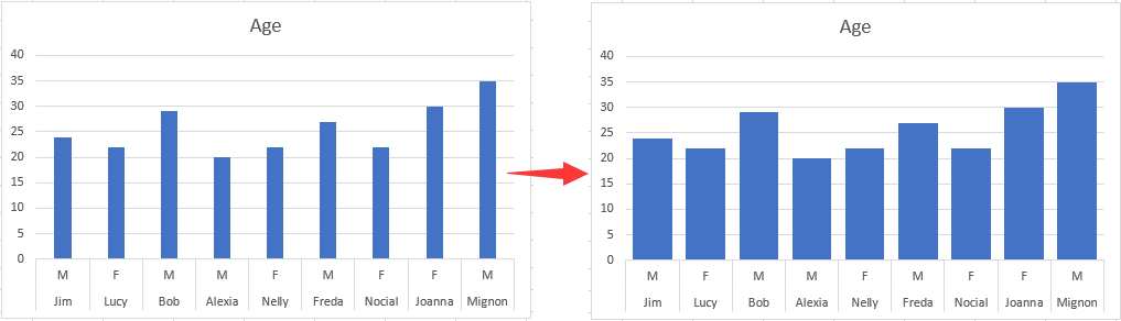
Addaswch y Siart Bar i wneud y bar yn ehangach yn Excel
I wneud bar yn ehangach mewn Siart Bar, gwnewch fel a ganlyn.
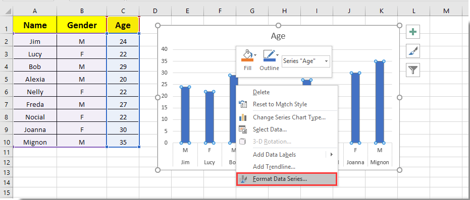
1. Cliciwch ar unrhyw far yn y Siart Bar a chliciwch arno, yna dewiswch Cyfres Data Fformat o'r ddewislen clicio ar y dde. Gweler y screenshot:
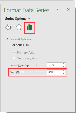
2. Yn y popping up Cyfres Data Fformat cwarel, symudwch y Zoom bar y Lled Bwlch i'r ochr chwith nes bod lled y bar yn cwrdd â'ch anghenion o dan y Dewisiadau Cyfres adran. Gweler y screenshot.
3. Caewch y Cyfres Data Fformat pane.
Yna gallwch weld bariau mewn Siart Bar penodedig yn dod yn ehangach fel y dangosir isod y screenshot.
Supercharge Eich Sgiliau Excel gyda Kutools ar gyfer Excel, a Phrofiad Effeithlonrwydd Fel Erioed Erioed. Kutools ar gyfer Excel Yn Cynnig Dros 300 o Nodweddion Uwch i Hybu Cynhyrchiant ac Arbed Amser. Cliciwch Yma i Gael Y Nodwedd Sydd Ei Angen Y Mwyaf...
This comment was minimized by the moderator on the site
Also been looking for a way to do this. Line chart over dates/times with bars when data (KGs) increased i.e. new delivery. Rather than change x axis type to text, I ended up having a filled border on bar. Need to select the same color fill as line and then select the border width to widen the bar. Can be done in VBA if chart is being produced with VBA?
This comment was minimized by the moderator on the site
Sorry... this doesn't work on a PC with Office365 2020.10. The control is there but even when set to zero percent for the gap width, the bars are scrawny little narrow bars which will accommodate no text overlay. Something not right.
This comment was minimized by the moderator on the site
Not in office365 but it might work for you, I have found a similar issue with "scrawny" bars on dates that adjusting overlay and gap width don't correct. To fix was as simple as reordering my data from oldest to newest and then changing axis type to "text axis" rather than "date axis" and then adjusting overlay and gap width. Give it a crack?
")
")