Sut i addasu'r Siart Bar i wneud bariau yn ehangach yn Excel?
Mae'r erthygl hon yn sôn am addasu Siart Bar i wneud pob bar yn ehangach yn Excel fel y dangosir isod y screenshot.
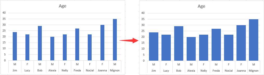
Addaswch y Siart Bar i wneud y bar yn ehangach yn Excel
Addaswch y Siart Bar i wneud y bar yn ehangach yn Excel
I wneud bar yn ehangach mewn Siart Bar, gwnewch fel a ganlyn.
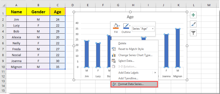
1. Cliciwch ar unrhyw far yn y Siart Bar a chliciwch arno, yna dewiswch Cyfres Data Fformat o'r ddewislen clicio ar y dde. Gweler y screenshot:
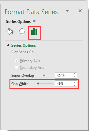
2. Yn y popping up Cyfres Data Fformat cwarel, symudwch y Zoom bar y Lled Bwlch i'r ochr chwith nes bod lled y bar yn cwrdd â'ch anghenion o dan y Dewisiadau Cyfres adran. Gweler y screenshot.
3. Caewch y Cyfres Data Fformat pane.
Yna gallwch weld bariau mewn Siart Bar penodedig yn dod yn ehangach fel y dangosir isod y screenshot.
Offer Cynhyrchiant Swyddfa Gorau
Supercharge Eich Sgiliau Excel gyda Kutools ar gyfer Excel, a Phrofiad Effeithlonrwydd Fel Erioed Erioed. Kutools ar gyfer Excel Yn Cynnig Dros 300 o Nodweddion Uwch i Hybu Cynhyrchiant ac Arbed Amser. Cliciwch Yma i Gael Y Nodwedd Sydd Ei Angen Y Mwyaf...
")
Mae Office Tab yn dod â rhyngwyneb Tabbed i Office, ac yn Gwneud Eich Gwaith yn Haws o lawer
- Galluogi golygu a darllen tabbed yn Word, Excel, PowerPoint, Cyhoeddwr, Mynediad, Visio a Phrosiect.
- Agor a chreu dogfennau lluosog mewn tabiau newydd o'r un ffenestr, yn hytrach nag mewn ffenestri newydd.
- Yn cynyddu eich cynhyrchiant 50%, ac yn lleihau cannoedd o gliciau llygoden i chi bob dydd!
")